No description
- Dart 88.3%
- Kotlin 5.8%
- Swift 5.4%
- Objective-C 0.5%
| example | ||
| lib | ||
| .gitignore | ||
| .metadata | ||
| CHANGELOG.md | ||
| LICENSE | ||
| pubspec.lock | ||
| pubspec.yaml | ||
| README.md | ||
checkbox_formfield

A few kinds of checkbox that can be used as FormField
Getting Started
This library currently has two Widgets.
- CheckboxListTileFormField: Use CheckboxListTile in Form
- CheckboxIconFormField: Use two Icons as if they consist a checkbox and also in Form
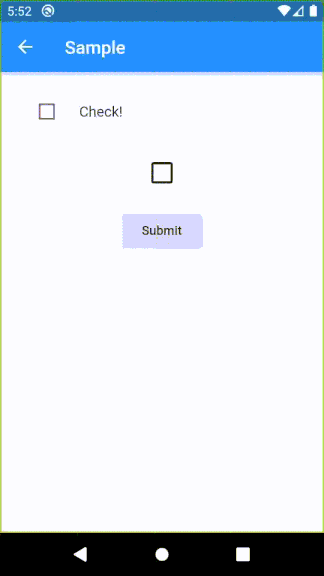
Demo
Usage sample
Please check example/lib in this library.
Specifications
CheckboxListTileFormField
| Parameter | Description |
|---|---|
| key | FormField.key |
| title | CheckboxListTile.title |
| context | Provide a default color to errorColor |
| onSaved | FormField.onSaved |
| validator | FormField.validator |
| initialValue | FormField.initialValue |
| autovalidateMode | FormField.autovalidateMode |
| enabled | Whether the checkbox is enabled |
| dense | CheckboxListTile.dense |
| errorColor | Color of error message Default: Theme.errorColor (context is given), Colors.red (otherwise) |
| activeColor | CheckboxListTile.activeColor |
| checkColor | CheckboxListTile.checkColor |
| controlAffinity | CheckboxListTile.controlAffinity |
| secondary | CheckboxListTile.secondary |
| contentPadding | CheckboxListTile.contentPadding |
| autofocus | CheckboxListTile.autofocus |
CheckboxIconFormField
| Parameter | Description |
|---|---|
| key | FormField.key |
| context | Provide a default color to errorColor |
| onSaved | FormField.onSaved |
| initialValue | FormField.initialValue |
| autovalidateMode | FormField.autovalidateMode |
| enabled | Whether the checkbox is enabled |
| trueIcon | IconData if true Default: Icons.check |
| falseIcon | IconData if false Default: Icons.check_box_outline_blank |
| trueIconColor | Color if true Default: Theme.colorScheme.secondary (if context is given), Theme.iconTheme.color (otherwise) |
| falseIconColor | Color if false Default: Theme.iconTheme.color |
| disabledColor | Color if disabled Default: Theme.disabledColor |
| padding | paddingDefault: 24.0 |
| iconSize | Icon.size |